Why is there a Volatility Skew?
Read on to find out why volatility skews exist, what the shape means and how you can prove them with historical data...
A volatility skew is the shape made when plotting the implied volatility points for each strike price in a given expiration month. The shape, when graphed, varies between asset types but generally looks like a "smile".
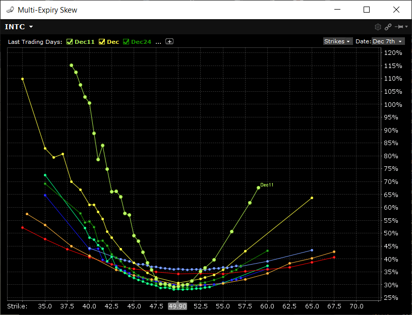
Here is an actual example of a 16 day vol skew of INTC stock.
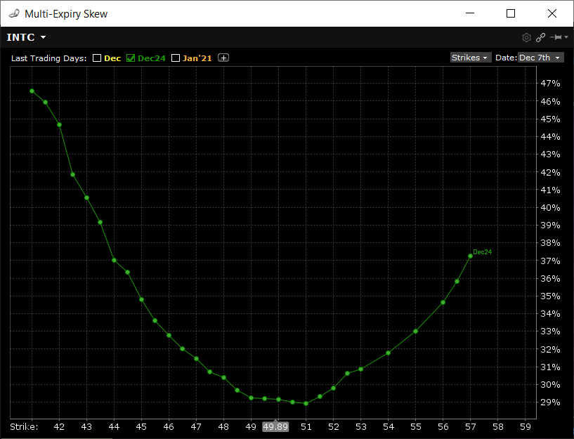
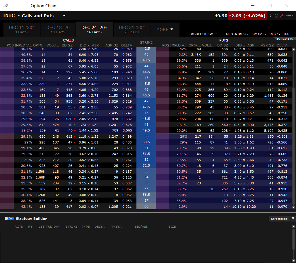
In this graph, using INTC options that have 16 days left to expire, volatility points are taken from the bid/ask prices that are in the live market for that expiration month. The resulting points you see are the mid point implied vols of the bid and ask prices. For clarity, here is the option chain for that month from where the graph was taken:
[in truth, it's only OTM options that are used to generate the volatility skew]
Why is Implied Volatility Different per Strike Price?
Implied volatility is an estimate of what volatility the underlying asset will experience from now until the expiration date of the option. Each strike price represents a possible price movement for the underlying security.
The underlying asset volatility, however, is constantly changing (as calculated by the amount of daily price movements). Generally, the greater the underlying price movement, the higher the volatility of the underlying will change. However, the reflected implied volatility of the market prices so not always reflect this.
Implied volatility fluctuates according to the markets view of the asset and how the underlying prices change. Wait, I know that sounds complicated, but let me explain with a comparison of asset types.
Commodities vs Equities
Volatility is all about panic. When equity markets drop, volatility increases, especially implied volatility, as investors scramble due to uncertainty as price drops are "unexpected". But a positive increase in equity prices won't effect the implied vol in the same way. Why? It's because people don't panic as much when the stock market rallies; only when it drops. Unless the positive move is very large, then IV will increase as there is an unexpectedly large upward price move.
With commodities, however, there is panic on both sides of price movements as higher prices cause panic in buyers who use those commodities for their business. Think of cafe. As the price of coffee rises, there is panic on their bottom line so they will look to purchase more coffee to secure their inventory.
So, an equity volatility curve has relatively lower volatility on the upside and higher volatility on the downside, which is in-line with how investors feel about price movements. Commodities typically have more symmetrical increases in volatility on both sides of the current price.
Should you be concerned with Volatility Skew?
Implied volatility is definitely an attribute that option traders need to be aware of. But does the skew really matter and if so, how can you use it?
Skew Shifts Give Insight into Market Direction
The shape of skews isn't always symmetrical, especially in equities markets. As can be seen in the above example, there is a slight tilt in curve where the put side will show higher vols than the equivalent distant call side.
Btw, this tilt is often what traders refer to as the actual skew. Taking the 25 delta call volatility from the 25 delta put volatility will give a skew value in relative % terms that can be used to measure the tilt.
What's important to note about the tilt though is that, as with the volatility itself, the tilt also changes, or shifts up and down as the underlying price moves. This change in tilt often gives us insight into what the market thinks regarding the future direction of the underlying.
Often when a stock goes through a large, unexpected upward price move, the tilt of the curve (i.e the 25 delta difference) will increase. This shows that there is more buying pressure for downside (or OTM) put options relative to the upside call options. This means that the market thinks the stock is overbought and expects the stock to reverse direction and make a move in the opposite direction. Of course, this isn't guaranteed, but is an indication from the option market due to the buying/selling pressure of the options in a given expiration.
Verifying the Skew with Historical Data
If option prices create the skew because of how traders expect the underlying to move, then surely price movements can be verified to have a volatility skew too?
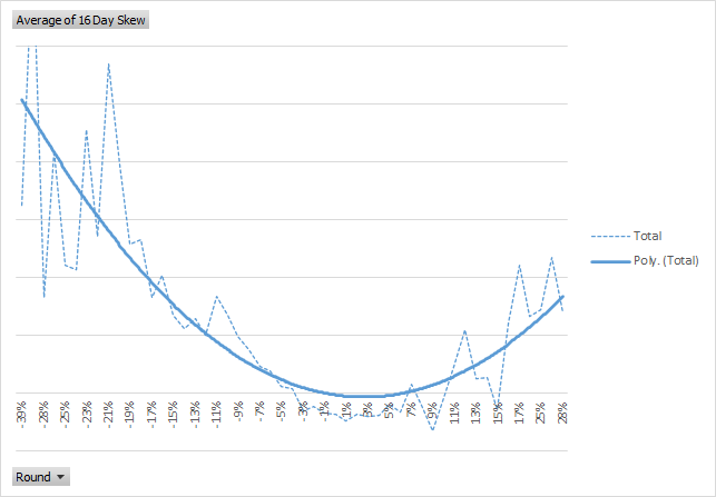
A simple way to see the historical vol path is to measure and aggregate the change in volatility vs a defined price change period.
Take a look at this simple historical vol skew example.
I downloaded INTC data from Yahoo!. Then I calculated the standard deviation for a rolling 16 day period.
Next, for each trading day I calculated what the 16 day price change was i.e today minus the closing price 16 days ago. For that same period I then calculated the change in 16 day volatility for the same time period.
To create somewhat meaningful data I needed to round the volatility numbers to 1 decimal in order to reduce the number of volatility "bands" used to aggregate. Then I used a pivot table in Excel to average out the observations for each rounded price change.
The resulting plot is obviously a bit scattered, but using a polynomial trend line over the aggregated volatility I get a "smile" that looks very much like the shape of the implied volatility. Here are both graphed side by side:
Implied Skew
Realized Skew
Pretty close I'd say. Tell me what you think by leaving a comment below:
0 Comments
No comments yet — be the first!
Add a Comment