Collar
| B/S | Strike | Type | Price |
|---|---|---|---|
| Buy 100 Shares | N/A | Stock | $50 |
| Buy 1 | $49 | Put | $0.97 |
| Sell 1 | $51 | Call | $1.00 |
| Net Debit | $5,003 | ||
A Collar is being long the underlying asset while shorting an OTM call and also buying an OTM put with the same expiration date.
The Max Loss is any loss taken on the stock +/- the premium for the options. The loss on the stock will be the purchase price of the stock minus the strike price of the put option (as you will exercise at that price) plus the net premium paid or received.
The Max Gain The profit of the stock +/- the premium for the optoins. The profit on the stock will be the strike price of the call option minus the purchase price of the stock (as you will be exercised and deliver at the strike) plus the net premium paid or received.
Characteristics
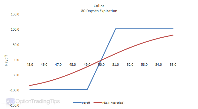
As you can see from the above payoff chart, a collar behaves just like a long call spread.
It is suited to investors who already own the stock and are looking to:
- increase their return by writing call options
- minimize their downside risk by buying put options
Covered calls are becoming very popular strategy for investors who already own stock. They sell out-of-the-money call options at a price that they are happy to sell the stock at in return for receiving some premium upfront. If the stock doesn't trade above this level, the investor keeps the premium.
The problem with covered calls is that they have unlimited downside risk.
The solution to this is to protect the downside by buying an out-of-the-money put.
This increases the cost as you will have to outlay more to purchase the put and hence lowers your overall return.
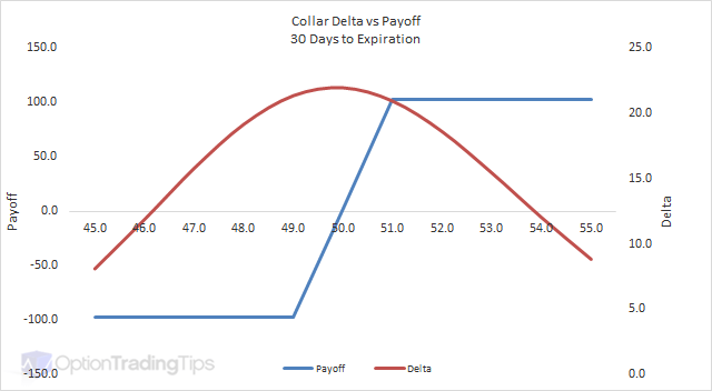
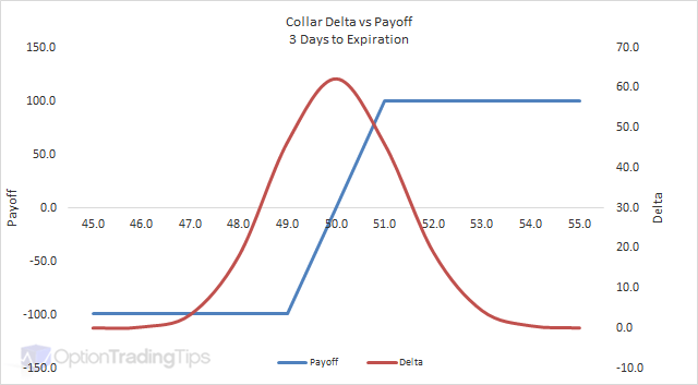
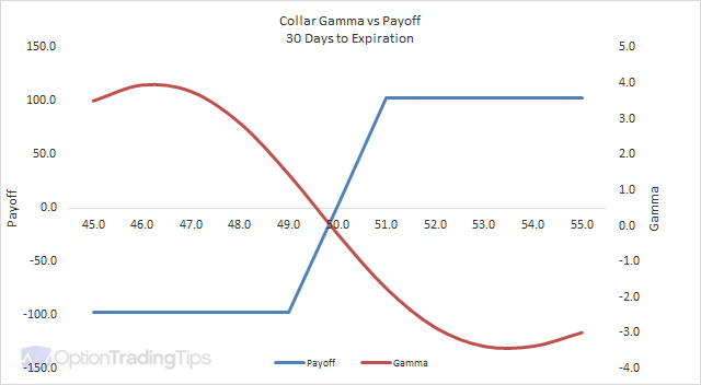
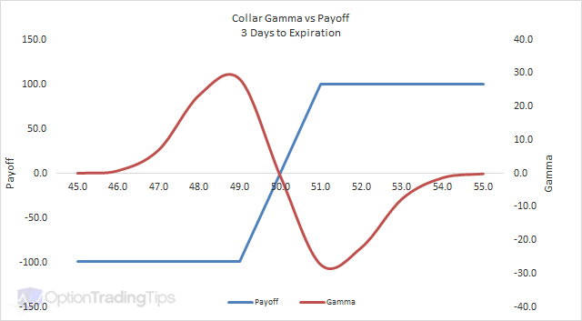
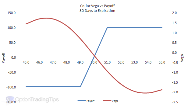
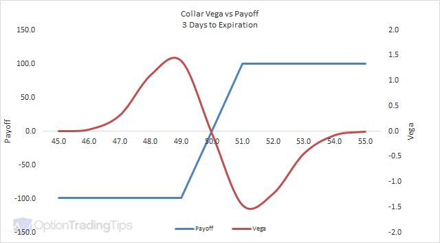
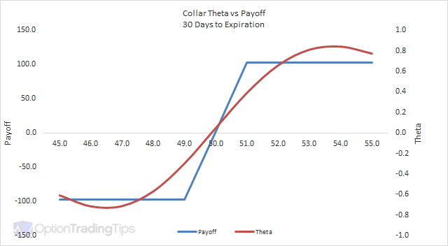
Collar Greeks
Delta
Gamma
Vega
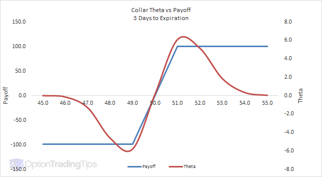
Theta
23 Comments
Pierre June 22nd, 2011 at 8:31am
Hi Peter,
Am I right if I say that a Collar and a Protected Covered Call (section Covered Call) are the same product or there is a difference ?
Thank you
Peter December 17th, 2010 at 10:04pm
The x-axis represents the stock price and the y-axis shows the profit and loss. The blue line is the P&L at the expiration date while the pink line is the theoretical P&L with 60 days left to expiration.
ajay December 17th, 2010 at 9:49am
i cudn't understand..the graph..what is P&L..what does vertical and horizontal axes stand for..plz make it clear
Peter August 19th, 2010 at 6:02pm
Hi Phil, by the definition of a collar the options have to belong to the same expiration date. I actually do not know what this type of spread would be called. I checked Natenburg's Option Volatility and Pricing and couldn't find it mentioned there either. I would guess that it's just a type of diagonal spread.
I'm not sure about your second question. Do you mean can you still sell call options prior to the expiration of the 6 month put option?
Phil August 19th, 2010 at 1:38am
If the call I sell and the put I buy do not have the same expiration month, is it still a "collar"?
If I buy a six month put, can I not get the premiums on two three month calls during that time?
Peter July 24th, 2010 at 9:17am
Optionable underlyings have more than one expiration month. For example, at the time of writing, MSFT have electronic tradable options that expire January 2012.
Anyway, the graphs are just for illustration purposes.
venkat July 16th, 2010 at 12:21pm
how can we have 60 days left to expiration as the contracts are monthly
Peter June 10th, 2010 at 5:55am
It's the theoretical P&L calculated with 60 days left to expiration.
JH June 10th, 2010 at 3:35am
I don't understand the "P&L 60 days" part of the graph. Is that explained anywhere?
Peter April 29th, 2009 at 8:22pm
Hi Sarish,
OTM = Out of the Money
ITM = In the Money
ATM = At the Money
Add a Comment